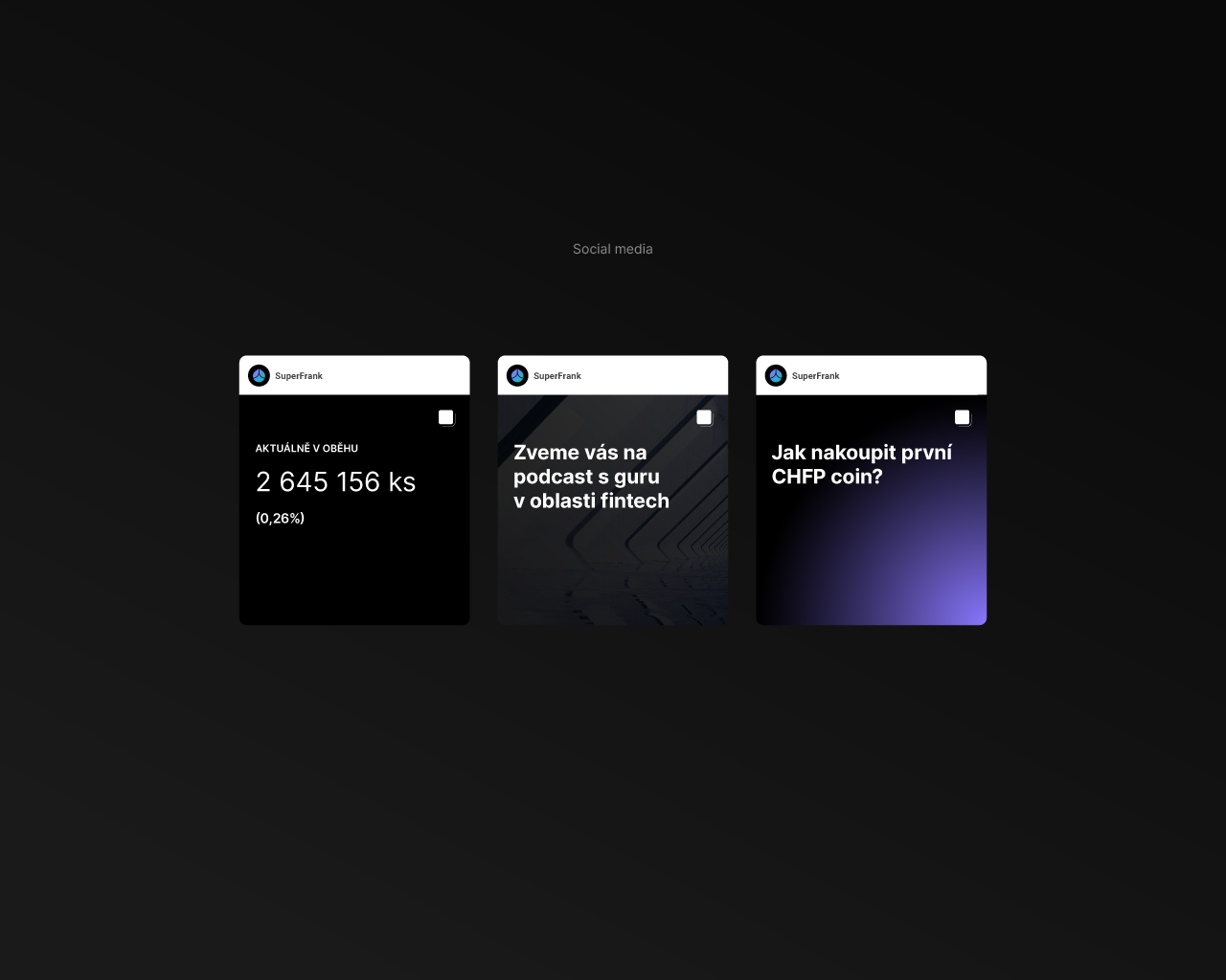
SuperFrank
crypto branding
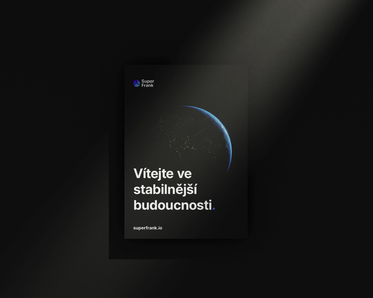
Full brand identity for a new stablecoin entering a market full of noise — built on the principle that stability speaks for itself.
SuperFrank is a stablecoin — a cryptocurrency category defined by its resistance to the volatility that makes most digital assets difficult to use as actual currency. Launching into a market dominated by visual excess, hype-driven branding, and projects that shout to compensate for uncertainty, SuperFrank needed to do the opposite: communicate stability, trust, and confidence through restraint.
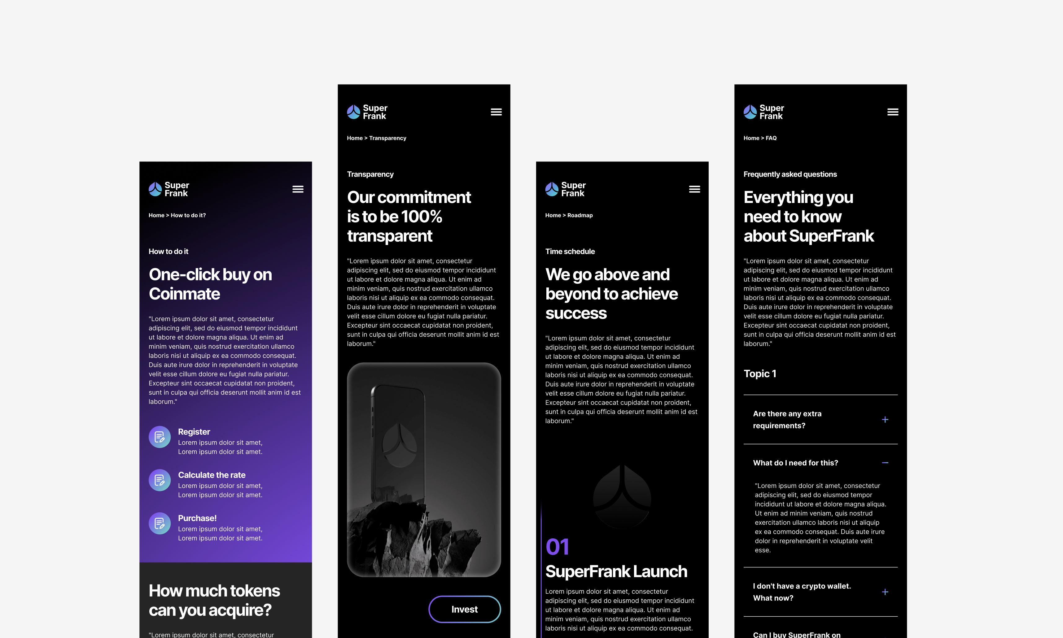
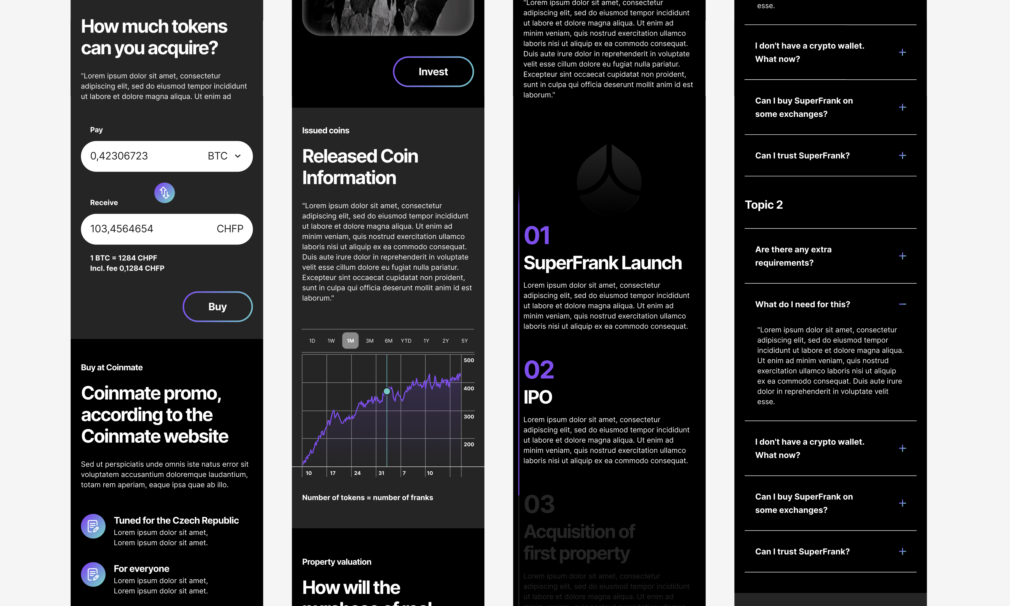
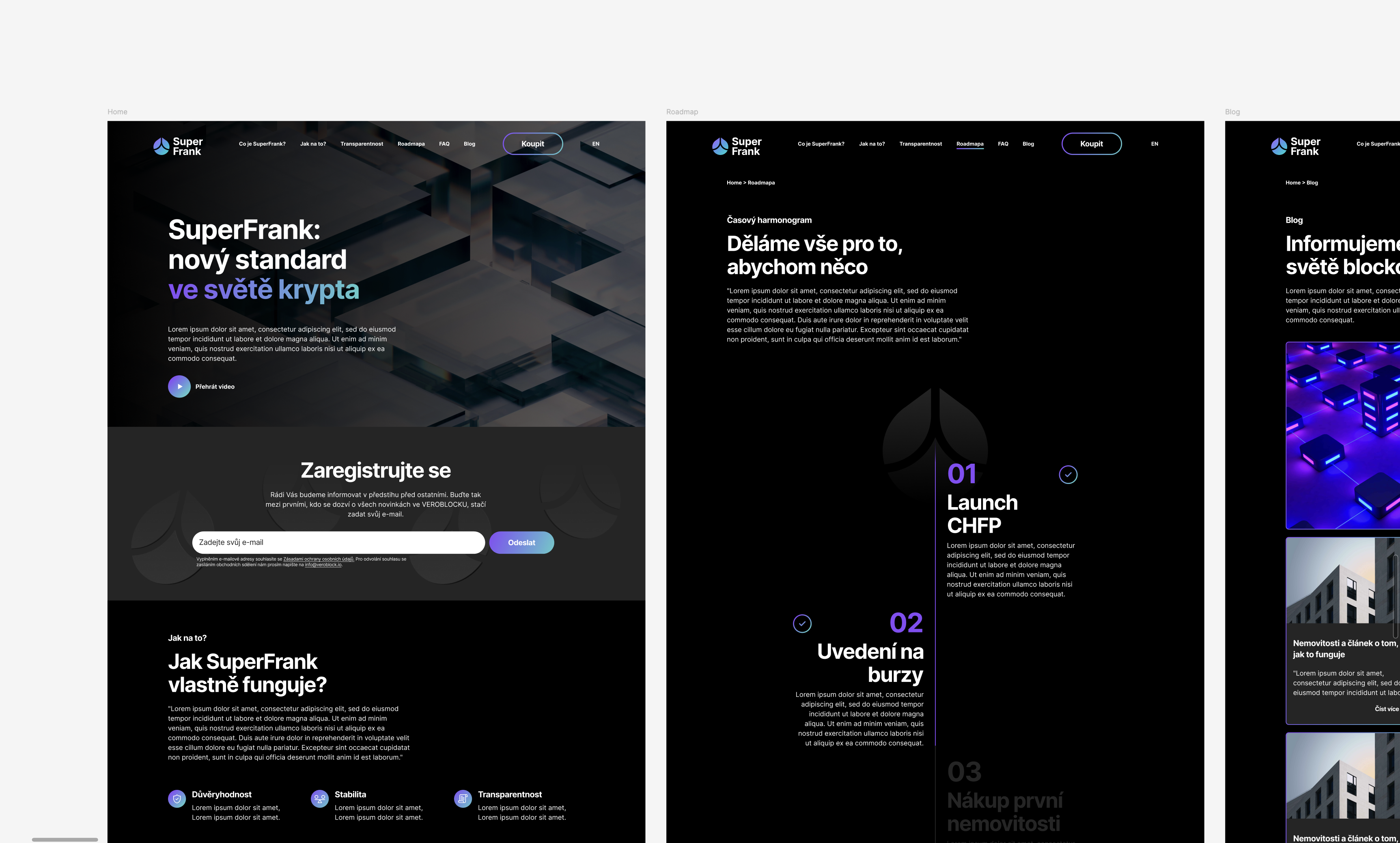
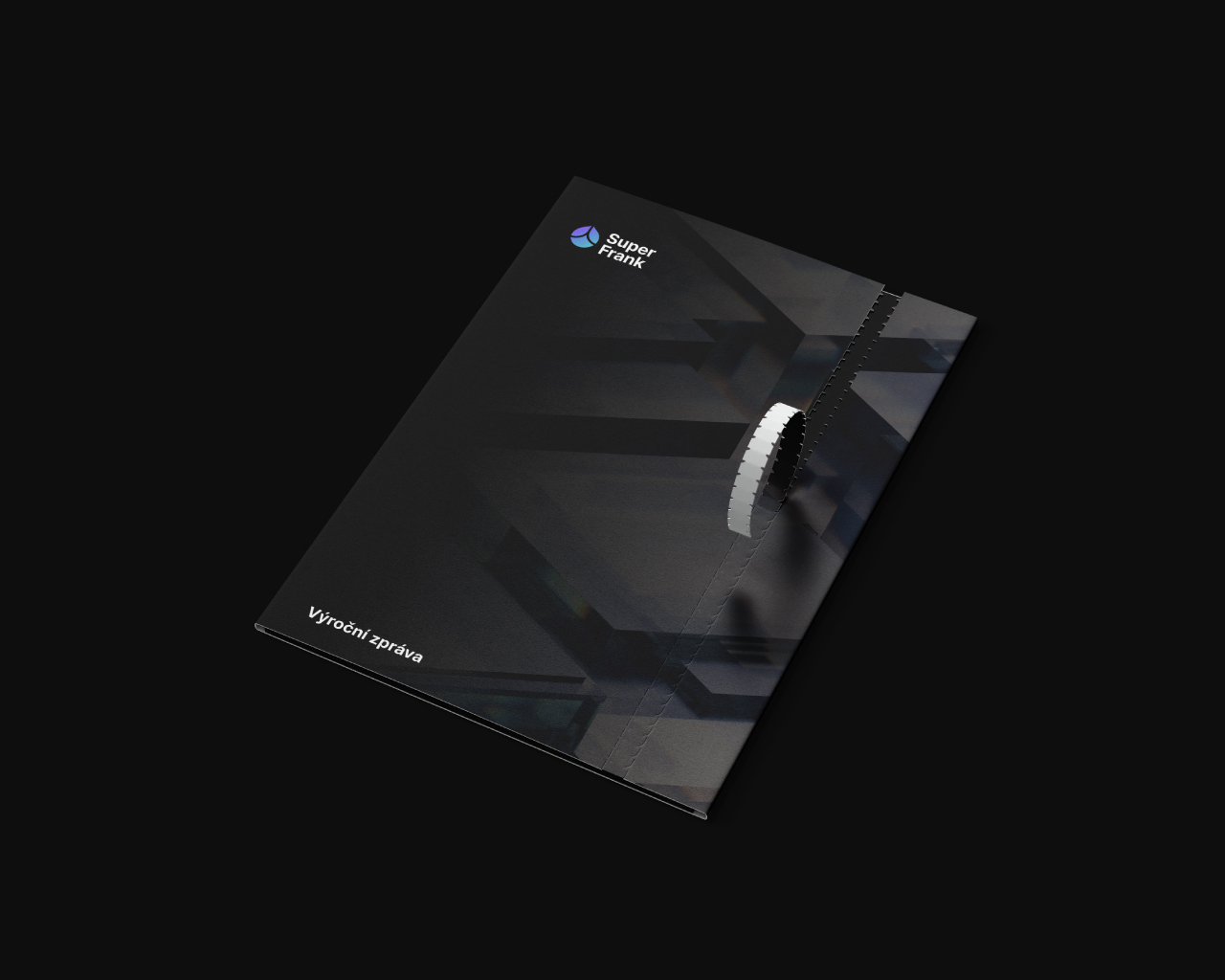
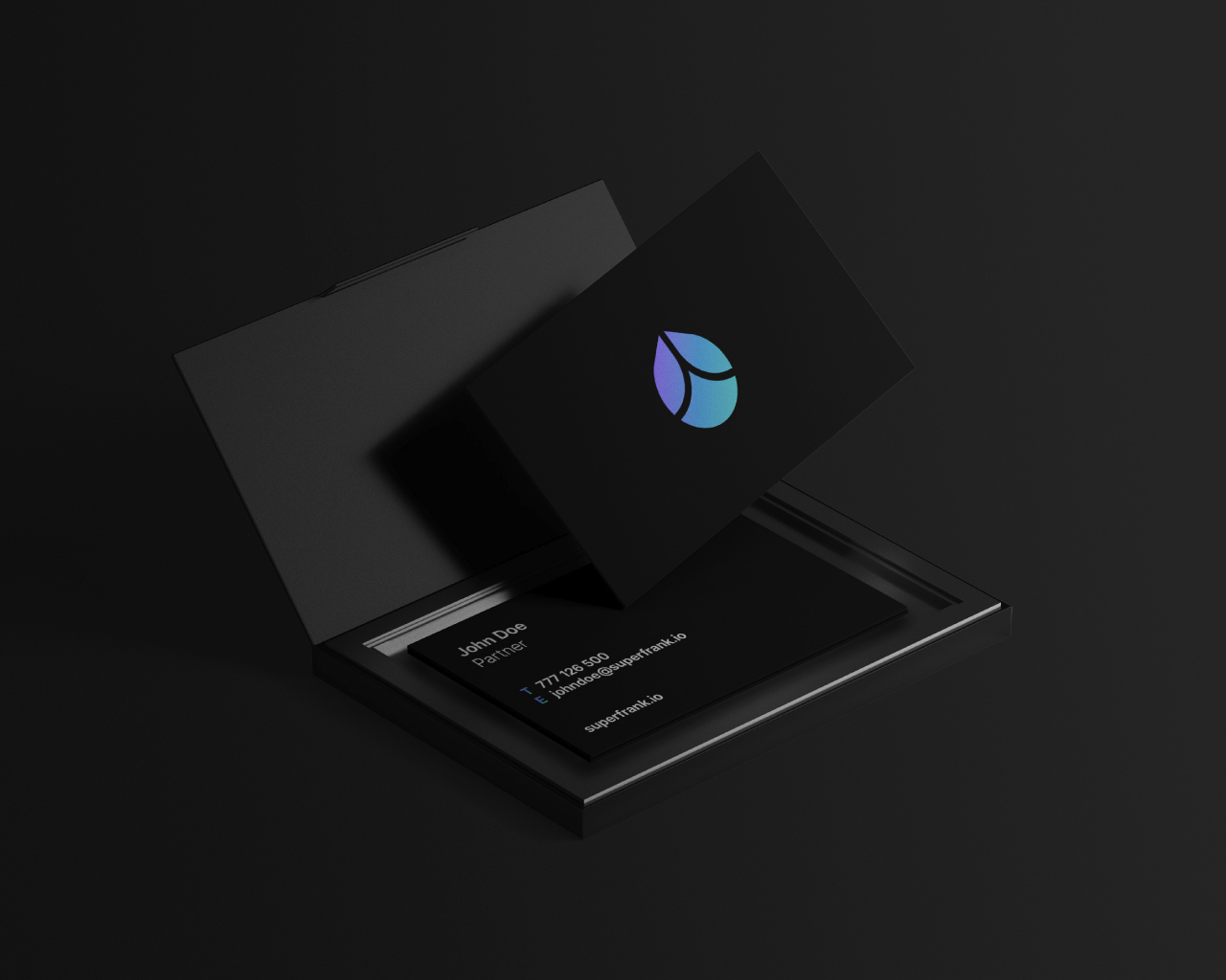
The engagement covered the complete brand identity — logo inspired by the Gömböc, a geometric solid with a single stable equilibrium point, chosen as a visual metaphor for the project's core promise. From there: a full logo manual and brand guidelines specifying colour, typography, imagery and tone of voice, a presentation template, and the website UI including a purchase funnel for acquiring the token.